- HR:+91-879-9184-787
- Sales:+91-908-163-7774

If you’re diving into mobile app development, you’ve probably stumbled upon React Native. But have you heard about React Native Flexbox? It’s like the secret functionality that makes your layouts not just functional but also stunningly attractive.
Flexbox, or the Flexible Box Layout, is a layout model that allows you to design complex layouts with ease. Think of it as a magic tool that helps you align and distribute space among items in a container. Whether you’re building a simple mobile app or a complex UI, Flexbox can save you loads of time and headache.
In this guide, we’ll explore everything there is to know about Flexbox in React Native, from the basics to advanced techniques. So, buckle up!
In React Native, Flexbox is a layout system used to arrange and align components within a container. It provides a consistent layout structure across different screen sizes, making it highly effective for mobile app development where varying screen dimensions are common.
React Native’s implementation of Flexbox is specifically tailored for mobile, which means it optimizes layouts for small screens without the need for excessive manual styling adjustments. Flexbox allows developers to build responsive layouts efficiently by handling the size, alignment, and distribution of elements inside containers.
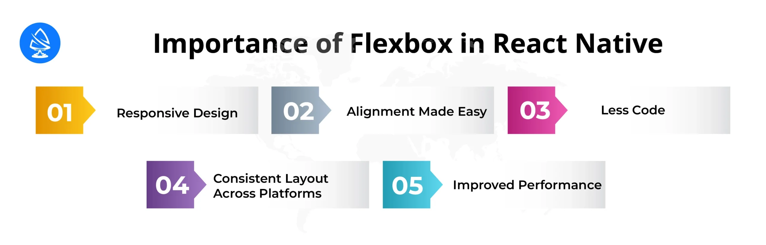
Flex in React Native plays a crucial role in creating responsive designs. Mobile applications need to adapt to various screen sizes, and Flexbox automatically adjusts component sizes and layouts based on the screen dimensions. This ensures a consistent user experience across devices like smartphones and tablets, without requiring developers to write multiple styles for different screen sizes.
With Flexbox, complex alignment tasks become simple and intuitive. By using properties like `justifyContent` and `alignItems`, developers can easily align components both horizontally and vertically. Whether centering an item or distributing components with equal spacing, Flexbox provides an efficient way to manage layout alignment without resorting to manual positioning.
Flexbox reduces the need for writing extensive layout code. Instead of manually specifying margins, padding, or absolute positioning for each component, developers can use concise Flexbox properties to handle layouts. This results in cleaner, more maintainable code that is easier to read and understand.
Flexbox ensures that layouts behave consistently across iOS and Android devices. React Native’s cross-platform capabilities are enhanced by Flexbox, as it allows developers to define one set of layout rules that work seamlessly on both platforms. This reduces the need for platform-specific code and testing.
Flexbox is optimized for modern UI development in mobile environments. It efficiently calculates and renders layouts, which improves the app’s performance by reducing the need for recalculating layouts during screen transitions or changes in orientation. This leads to a smoother user experience and faster rendering times.

Ready to jump in? Get your development environment ready to start with React Native Flexbox.
Flexbox in React Native is an essential layout system used to design responsive, flexible, and efficient user interfaces for mobile apps. Since React Native doesn’t rely on traditional web-based layout systems like CSS Grid or float-based layouts, Flexbox becomes the backbone for organizing and aligning components on the screen. It ensures that elements respond well to different screen sizes and orientations, making it a must-learn concept for mobile app development.
To get started with Flexbox in React Native, you first need to install React Native, set up your project, and then dive into how to use Flexbox for laying out components. Here’s a step-by-step guide to help you begin.
Before you can start using Flexbox in React Native, you need to install React Native itself. There are two primary ways to install React Native depending on whether you want to use Expo CLI or React Native CLI.
Expo is an easy-to-use toolchain that lets you run React Native apps without worrying about native build configurations (i.e., no need for Xcode or Android Studio setup initially). To install Expo CLI:
| npm install -g expo-cli |
| expo init MyProject |
Expo simplifies app development by providing pre-configured settings, making it ideal for beginners. However, it may have limitations if you need deeper native integrations.
React Native CLI gives you full control over your app’s native code, making it suitable for more advanced projects. To install:
| npm install -g react-native-cli |
| npx react-native init MyProject |
With React Native CLI, you get complete control over the app’s build process, but the setup can be more complex.
After installing React Native, the next step is to set up your first project to test Flexbox layouts. Here’s how to do it:
Whether you’re using Expo or React Native CLI, once the installation is done, you will create your project. In this example, we’ll use the React Native CLI:
| npx react-native init FlexboxDemo cd FlexboxDemo |
This will create a new directory named `FlexboxDemo` containing all the necessary files for your React Native project.
To start the app, run the following command:
| npx react-native run-android |
(For Android development)
Or:
| npx react-native run-ios |
(For iOS development)
This will start the development server and open the app in your emulator or connected device.
Once the project is running, you can start building the layout using Flexbox in the `App.js` file. Replace the default code with the following simple Flexbox example:
| import React from ‘react’; import { View, Text, StyleSheet } from ‘react-native’; const App = () => { return ( <View style={styles.container}> <View style={styles.box1}><Text>Box 1</Text></View> <View style={styles.box2}><Text>Box 2</Text></View> <View style={styles.box3}><Text>Box 3</Text></View> </View> ); }; const styles = StyleSheet.create({ container: { flex: 1, flexDirection: ‘row’, justifyContent: ‘space-around’, alignItems: ‘center’, }, box1: { backgroundColor: ‘red’, padding: 20 }, box2: { backgroundColor: ‘green’, padding: 20 }, box3: { backgroundColor: ‘blue’, padding: 20 }, }); export default App; |
In this code:
Now, save your changes and reload the emulator or device. You should see three boxes arranged horizontally, using Flexbox for layout.
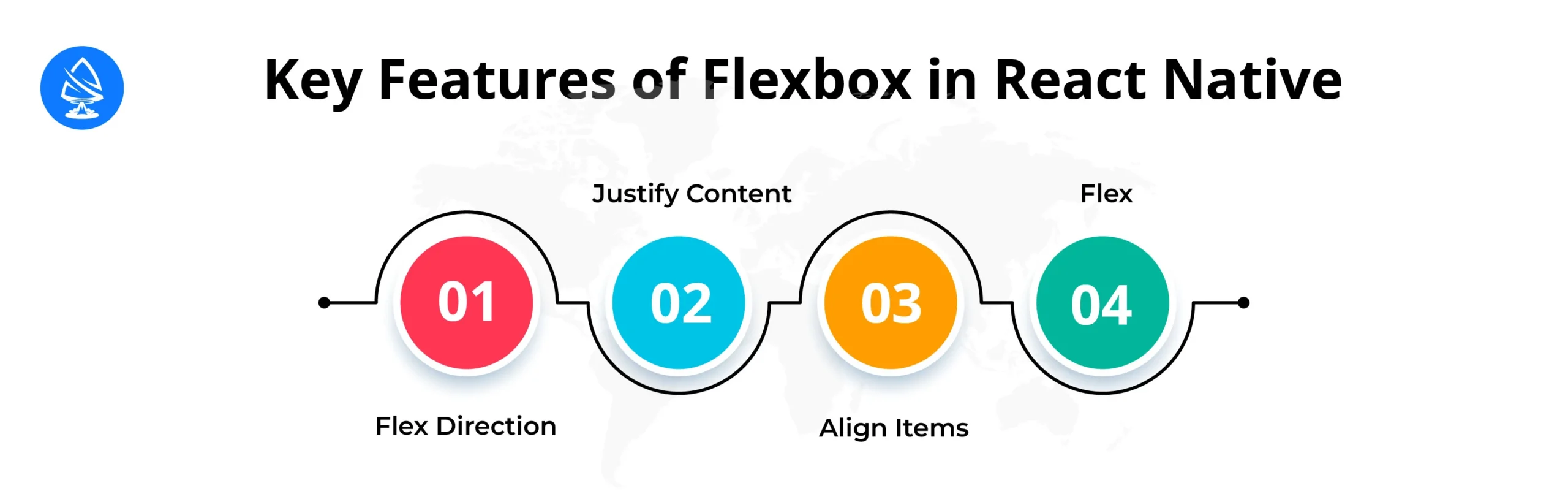
Flexbox is a powerful layout model in React Native that allows developers to create responsive and adaptive user interfaces. Understanding the key Flexbox properties is essential to mastering layouts in React Native. These properties help define how components should be arranged, sized, and aligned within their containers, making it easy to handle complex UIs with minimal code.
The `flexDirection` property defines the primary axis along which the child components are laid out within a container. By default, React Native uses `column`, meaning that elements are stacked vertically. However, you can easily switch to a horizontal layout using `row`. Here’s how each value works:
| flexDirection: ‘column’; |
| flexDirection: ‘row’; |
| flexDirection: ‘column-reverse’; |
| flexDirection: ‘row-reverse’; |
By using `flexDirection`, you can control the flow of your layout, whether you want to place items in a row or stack them in a column.
The `justifyContent` property determines how child components are distributed along the main axis (the axis defined by `flexDirection`). It controls the spacing between and around the components, allowing developers to position elements inside their container in various ways.
Here are the possible values of `justifyContent`:
| justifyContent: ‘flex-start’; |
| justifyContent: ‘flex-end’; |
| justifyContent: ‘center’; |
| justifyContent: ‘space-between’; |
| justifyContent: ‘space-around’; |
| justifyContent: ‘space-evenly’; |
The `justifyContent` property is especially useful when you want to manage spacing dynamically across different screen sizes and orientations, allowing for more responsive designs.
The `alignItems` property controls the alignment of child components along the cross-axis (perpendicular to the main axis). While `justifyContent` affects the distribution along the main axis, `alignItems` manages how items are placed on the opposite axis.
Here are the available values of `alignItems`:
| alignItems: ‘flex-start’; |
| alignItems: ‘flex-end’; |
| alignItems: ‘center’; |
| alignItems: ‘stretch’; |
| alignItems: ‘baseline’; |
The `alignItems` property is key to creating visually balanced layouts where components align properly, even across different screen orientations or dynamic content changes.
The `flex` property defines how a component should grow or shrink to fit the available space within a container. It is a shorthand for the combination of `flex-grow`, `flex-shrink`, and `flex-basis`. The `flex` property helps determine how much space each item will take relative to its siblings.
| flex: 0; |
| flex: 1; |
| flex: 2; |
By assigning `flex` values to components, you can create layouts that dynamically resize and distribute space based on the screen size, ensuring that the layout remains responsive.
Flexbox is a powerful tool in React Native for creating responsive, adaptive layouts. While basic Flexbox properties like `flexDirection`, `justifyContent`, `alignItems`, and `flex` are often enough for simple layouts, more advanced techniques allow for greater flexibility and control over complex UI designs.
These techniques, such as nesting Flexbox containers and using Flexbox to build non-traditional UI components like charts, can take your React Native layouts to the next level.
Nesting Flexbox involves placing Flexbox containers inside other Flexbox containers to create more intricate layouts. This technique is especially useful when you need a multi-level hierarchy of layouts, where different sections of the app need distinct flex properties. It allows you to combine various layout behaviors within different parts of your UI.
Suppose you have a layout where a screen is divided into two sections: a header and a content area. Inside the content area, you want two side-by-side blocks that also contain vertically stacked elements. Nesting Flexbox allows you to easily manage this structure.
| import React from ‘react’; import { View, Text, StyleSheet } from ‘react-native’; const App = () => { return ( <View style={styles.container}> {/* Header */} <View style={styles.header}> <Text style={styles.headerText}>Header</Text> </View> {/* Content Area with Nested Flexbox */} <View style={styles.content}> {/* First Block */} <View style={styles.block}> <Text>Block 1 – Item 1</Text> <Text>Block 1 – Item 2</Text> </View> {/* Second Block */} <View style={styles.block}> <Text>Block 2 – Item 1</Text> <Text>Block 2 – Item 2</Text> </View> </View> </View> ); }; const styles = StyleSheet.create({ container: { flex: 1, }, header: { flex: 1, justifyContent: ‘center’, alignItems: ‘center’, backgroundColor: ‘#f8b400’, }, headerText: { fontSize: 20, }, content: { flex: 4, flexDirection: ‘row’, justifyContent: ‘space-around’, alignItems: ‘center’, }, block: { flex: 1, justifyContent: ‘space-around’, alignItems: ‘center’, backgroundColor: ‘#add8e6’, margin: 10, padding: 20, }, }); export default App; |
Charts are a popular way to visually represent data in mobile apps, and Flexbox can be a helpful tool when building simple chart-like structures in React Native. Although dedicated chart libraries like `react-native-svg-charts` or `VictoryNative` exist, you can use Flexbox to create basic bar or column charts when you need lightweight, customizable solutions without additional dependencies.
Here’s how you can use Flexbox to build a simple horizontal bar chart where each bar represents a data value.
| import React from ‘react’; import { View, Text, StyleSheet } from ‘react-native’; const BarChart = () => { const data = [ { label: ‘Jan’, value: 50 }, { label: ‘Feb’, value: 80 }, { label: ‘Mar’, value: 30 }, { label: ‘Apr’, value: 70 }, ]; return ( <View style={styles.chartContainer}> {data.map((item, index) => ( <View key={index} style={styles.chartRow}> <Text style={styles.label}>{item.label}</Text> <View style={[styles.bar, { width: `${item.value}%` }]} /> <Text style={styles.value}>{item.value}</Text> </View> ))} </View> ); }; const styles = StyleSheet.create({ chartContainer: { padding: 20, }, chartRow: { flexDirection: ‘row’, alignItems: ‘center’, marginBottom: 10, }, label: { width: 40, }, bar: { flex: 1, height: 20, backgroundColor: ‘#f8b400’, marginRight: 10, }, value: { width: 30, }, }); export default BarChart; |
Flexbox is ideal for creating simple, static charts like progress bars, loading bars, or small visualizations where you don’t need complex interactions or animations. However, when it comes to more advanced charts, such as pie charts, line graphs, or interactive charts, it’s generally better to use dedicated charting libraries.

Once you master advanced Flexbox techniques like Nesting Flexbox and using Flexbox for creative UI elements like charts, you can significantly improve the complexity and responsiveness of your React Native layouts.
Nesting allows you to build multi-level, flexible structures, while Flexbox for building charts provides a lightweight, customizable way to visualize data without the need for external libraries. These advanced techniques give you more control over your UI.
If you’re looking to bring your ideas to life but don’t want to go through the hassle of coding, you can hire React Native app developers from Artoon Solutions. Our qualified react native mobile application development team will transform your vision into a reality!
1. What is the difference between Flexbox and Grid in React Native?
Flexbox is great for one-dimensional layouts, while Grid is better for two-dimensional layouts. Flexbox manages space in a single direction, whereas Grid allows for more complex layouts with rows and columns.
2. Can I use Flexbox with other layout methods?
Yes! You can combine Flexbox React Native with other layout methods like absolute positioning for more control over your designs.
3. Is Flexbox supported in all versions of React Native?
Flexbox is natively supported in all versions of React Native, so you’re good to go!
4. How does Flexbox improve performance in React Native apps?
Flex React Native simplifies layout calculations, which can lead to better performance and faster rendering times.
5. Where can I find more resources to learn about React Native Flexbox?
There are plenty of online tutorials, documentation, and courses available to help you master React Native Flexbox!
Artoon Solutions
Artoon Solutions is a technology company that specializes in providing a wide range of IT services, including web and mobile app development, game development, and web application development. They offer custom software solutions to clients across various industries and are known for their expertise in technologies such as React.js, Angular, Node.js, and others. The company focuses on delivering high-quality, innovative solutions tailored to meet the specific needs of their clients.
 For business inquiries only