- HR:+91-879-9184-787
- Sales:+91-908-163-7774

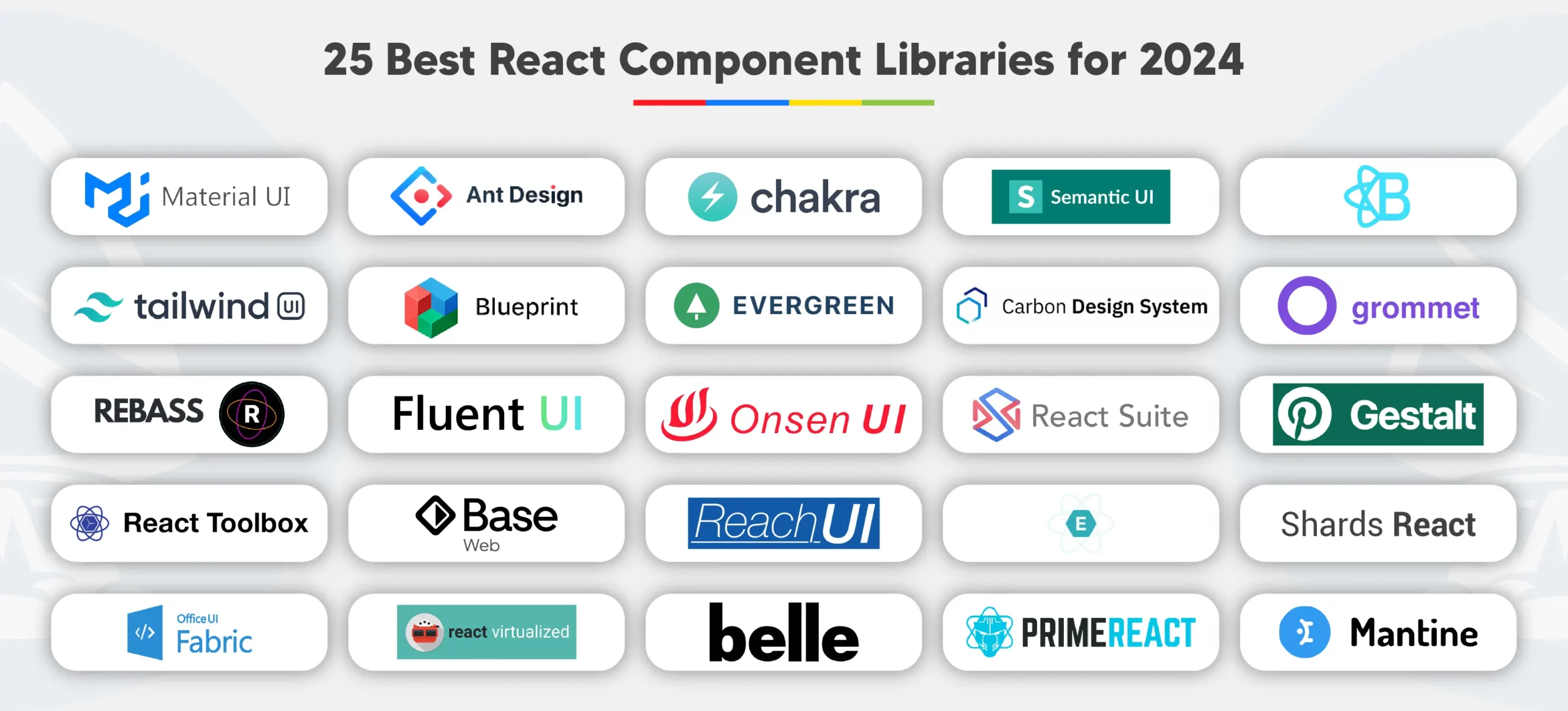
Let’s explore the 25 best React component libraries recommended for 2025:
One of the best react component library, Material UI, is a widely-used and highly-regarded choice for React developers in 2025. It offers a vast array of customizable components, adhering to Google’s Material Design guidelines. Material UI provides a cohesive and visually appealing design system, making it effortless to create modern and responsive user interfaces. With its extensive documentation and active community support, Material UI facilitates rapid development and seamless integration into React projects. Developers appreciate its flexibility, allowing them to easily customize components to suit their specific design requirements. Moreover, Material UI emphasizes accessibility, ensuring that applications built with it are usable by individuals with disabilities. Overall, Material UI stands out as a reliable and feature-rich top react component libraries, empowering developers to create visually stunning and accessible React applications with ease. React component libraries like Material-UI, Ant Design, or Chakra UI, which often include documentation covering React component lifecycle.
Ant Design is a comprehensive React component library that stands out for its unique design system and extensive feature set and help you to make react class component faster. Developed by Ant Group, it offers a wide range of components, including buttons, forms, navigation menus, and more, all designed with a cohesive and visually appealing aesthetic. Ant Design follows a minimalist approach, focusing on simplicity and usability while providing powerful customization options for developers.
One of Ant Design’s notable features is its rich ecosystem, which includes design resources such as icons, themes, and templates, enabling developers to create consistent and professional-looking interfaces quickly. The library also emphasizes accessibility, ensuring that components are usable by individuals with disabilities.
With its robust documentation, active community support, and regular updates, Ant Design continues to be a popular choice among React developers in 2025 for building modern, feature-rich, and visually appealing web applications with its component in react js.
Chakra UI is a highly regarded React component library known for its simplicity, modularity, and accessibility. Developed to streamline the UI development process, it provides prebuilt components that facilitate rapid project development, catering to diverse application needs. Its modular structure allows developers to pick and choose components, ensuring flexibility and easy customization.
With a focus on accessibility, Chakra UI ensures that web applications built using its components are usable by individuals with varying abilities. The library’s design principles prioritize user experience, making it an excellent choice for creating visually appealing and functional interfaces. Chakra UI stands out for its seamless integration with React applications, providing a hassle-free development experience. Developers appreciate its documentation and active community support, making it a reliable choice for building modern and inclusive web applications with its components in react js.
4. Semantic UI React UI Component Library
Semantic UI is a comprehensive UI component framework designed to simplify and streamline web development by providing a vocabulary for creating responsive and visually appealing interfaces. It focuses on using human-friendly HTML, making the markup concise and easy to understand. Semantic UI react offers a wide range of components, including buttons, forms, grids, and menus, allowing developers to build layouts efficiently. It emphasizes semantic and natural language conventions, making it intuitive for developers to work with.
One of Semantic UI’s notable features is its jQuery-free integration, which enhances performance and simplifies development. It also provides a declarative API and shorthand props for more straightforward component customization. With its robust documentation and active community support, Semantic UI is a popular choice for developers looking to create modern and responsive web applications with ease and efficiency.
React Bootstrap is a popular library that seamlessly integrates Bootstrap’s powerful UI components into React applications, offering a vast array of pre-designed components such as buttons, forms, modals, and navigation bars. It provides a comprehensive set of components that are compatible with the latest Bootstrap version, enabling developers to create responsive and visually appealing web interfaces with ease.
One of React Bootstrap’s key advantages is its adherence to the principles of components in React, ensuring efficient component rendering and seamless integration with React’s ecosystem. Developers appreciate React Bootstrap’s simplicity and ease of use, allowing them to build robust web applications quickly. Additionally, React Bootstrap offers extensive documentation and active community support, making it an ideal choice for developers seeking to leverage Bootstrap’s styling capabilities within their React projects.
Tailwind UI is the official component library for Tailwind CSS, offering a comprehensive collection of professionally designed UI components and templates. With over 500 fully responsive and expertly crafted component examples, Tailwind UI is react ui libraries which provides developers with a vast array of building blocks for creating modern web interfaces. These react functional components cover various categories such as navigation menus, forms, cards, and more, allowing for flexible and customizable designs. Tailwind UI components are designed to seamlessly integrate with Tailwind CSS, a utility-first CSS framework, enabling developers to leverage Tailwind’s utility classes for rapid styling and layout development.
One of the key advantages of Tailwind UI is its extensive customization options, allowing developers to tailor components to fit their specific design requirements. Additionally, Tailwind UI offers detailed documentation and examples, empowering developers to quickly implement and customize UI components in their projects.
Blueprint is a React-based UI toolkit developed by Palantir, optimized for creating complex and data-dense web interfaces for modern desktop applications. It offers a comprehensive set of reusable components, styles, and utilities to facilitate the development of robust and visually appealing user interfaces. Blueprint’s components are designed with performance and accessibility in mind, ensuring smooth user interactions and compliance with web accessibility standards.
One of Blueprint’s key features is its modular architecture, allowing developers to efficiently manage and customize components according to their specific project requirements. It provides extensive documentation and community support, making it accessible to developers of all levels. Blueprint’s components cover a wide range of functionalities, including navigation bars, forms, tables, and tooltips, enabling developers to build sophisticated web applications with ease.
Blueprint is widely recognized for its reliability, flexibility, and scalability, making it a popular choice among developers for building professional-grade web applications.
Evergreen is a comprehensive React UI Framework developed by Segment, a company based in San Francisco, CA. It provides a robust set of reusable components and design system primitives for building ambitious web applications. Evergreen’s design system is built with modularity and composability in mind, allowing developers to create elegant and consistent user interfaces effortlessly.
One of Evergreen’s key features is its extensive collection of polished React components, each catering to specific interaction and UI needs. These components are designed to work seamlessly out of the box, enabling developers to accelerate their development process while maintaining high-quality design standards. Evergreen emphasizes flexibility and adaptability, making it suitable for a wide range of projects, from simple websites to complex web applications.
With Evergreen, developers can leverage its versatile components, such as buttons, forms, modals, and navigation bars, to create delightful and user-friendly experiences for their audience. Its popularity stems from its user-friendly nature, comprehensive documentation, and active community support, making it a preferred choice for developers seeking to streamline their React development process.
The Carbon Design System is a comprehensive design system developed by IBM, encompassing a series of styles, components, and guidelines aimed at creating cohesive and user-friendly web and product interfaces. It serves as the foundation for IBM’s web and product designs, ensuring consistency and efficiency across various applications.
Carbon offers a wide range of components and patterns, including buttons, forms, icons, and data visualization elements, facilitating the creation of visually appealing and accessible interfaces. It also provides guidelines for usage and implementation, promoting best practices in design and development.
One of Carbon’s notable features is its support for Web Components, which adhere to modern web standards like Custom Elements and Shadow DOM, enabling seamless integration and compatibility with different frameworks and libraries. The system is open-source, allowing for community contributions and collaboration to further enhance its capabilities.
Grommet is a one of react ui component libraries designed to streamline the development of responsive and accessible web applications. It provides a comprehensive set of components that serve as the building blocks for creating modern user interfaces. With Grommet, developers can easily create mobile-first projects that prioritize accessibility and responsiveness.
The library offers a wide range of components such as Box, Card, Footer, Grid, and many more, empowering developers to create intuitive and visually appealing interfaces with ease. Grommet’s components are designed to be modular and customizable, allowing for seamless integration into various projects and enabling developers to maintain consistency across their applications.
Furthermore, Grommet prioritizes accessibility, ensuring that applications built with the library are usable by all individuals, including those with disabilities. Its theming capabilities enable developers to customize the visual appearance of their applications to align with brand guidelines or specific design requirements.
Overall, Grommet simplifies the development process by providing developers with a robust set of components and features that facilitate the creation of modern, responsive, and accessible web applications.
Rebass is a React component library known for its simplicity, flexibility, and ease of use. It provides a collection of customizable UI components that are designed to be highly composable, allowing developers to quickly build responsive and visually appealing user interfaces for their React applications.
One of Rebass’s key features is its use of styled-components or Emotion for styling, which enables developers to keep styles isolated and maintainable. This library follows a minimalist approach, offering essential components such as buttons, forms, and layout containers, making it suitable for prototyping and building UIs efficiently.
With Rebass, developers can leverage a theme-based approach for consistent styling across their applications, enhancing brand identity and user experience. Rebass’s straightforward API and comprehensive documentation make it accessible to developers of all skill levels, facilitating rapid development and iteration of React-based projects.
Overall, Rebass is valued for its simplicity, flexibility, and themeability, making it a popular choice among developers for building React applications with clean and modern UIs.
Fluent UI is a comprehensive component library developed by Microsoft, providing a collection of UX frameworks for building beautiful, cross-platform applications with consistent design, behavior, and code sharing. It offers a range of React components, web components, and utilities designed to facilitate the development of modern web applications.
One of the key aspects of Fluent UI is its focus on accessibility, ensuring that applications built with its components are usable by all users, including those with disabilities. It follows Microsoft’s Fluent Design System principles, emphasizing clarity, simplicity, and seamless user experiences across devices and platforms.
With Fluent UI, developers can create responsive and intuitive user interfaces using a rich set of pre-built components such as buttons, inputs, navigation bars, and more. The library also provides extensive documentation and support, making it suitable for both beginner and experienced developers looking to build professional-grade applications with consistent design and functionality.
Onsen UI is a powerful open-source HTML5 framework designed to create mobile and progressive web applications (PWAs) with ease. It offers a comprehensive set of UI components, including buttons, navigation bars, lists, and forms, all optimized for mobile devices. Onsen UI follows a hybrid approach, allowing developers to build apps using HTML5, CSS, and JavaScript while supporting integration with popular frameworks like Angular, React, Vue.js, and Meteor.
With Onsen UI, developers can create visually appealing and responsive mobile apps that provide a native-like user experience across various platforms and devices. The framework utilizes web components to ensure modularity, flexibility, and reusability of code components. Its architecture includes CSS components, web components, and framework bindings for flexible project choices.
Onsen UI streamlines development with robust tools, documentation, and support for modern mobile and web apps.
React Suite is a comprehensive suite of React components designed to provide a sensible UI design and a friendly development experience. It offers a wide range of components suitable for building modern web applications, including tables, forms, modals, buttons, and more.
One of the key features of React Suite is its emphasis on composition, allowing developers to easily compose complex UIs by combining smaller, reusable components. This approach promotes code reusability and maintainability, making it easier to manage large-scale projects.
The library also provides comprehensive documentation and examples to guide developers through the usage of each component. It ensures consistency in UI design and behavior across different components, facilitating a smooth and cohesive user experience.
Overall, React Suite is a valuable resource for React developers seeking a well-designed and efficient component library for their web applications.
Gestalt is Pinterest’s design system that includes a comprehensive React UI component library, aiming to deliver high-quality products with a consistent user experience. It provides a set of React UI components designed with a focus on simplicity, accessibility, and aesthetics.
This component library offers a wide range of components, including buttons, forms, inputs, navigation elements, and more, facilitating the development of visually appealing and user-friendly web applications. Gestalt follows best practices and guidelines, ensuring consistency and coherence in design and functionality across different applications.
Moreover, Gestalt provides comprehensive documentation, guidelines, and tools for designers and developers, making it easier to get started and integrate these components into projects seamlessly. With its emphasis on usability and design, Gestalt empowers developers to create engaging and intuitive user interfaces for their applications.
React Toolbox is an open-source library of React components that adheres to Google’s Material Design guidelines. It provides developers with a set of reusable UI components, such as buttons, input fields, navigation bars, and more, designed to create modern and visually appealing user interfaces. Powered by CSS Modules, React Toolbox seamlessly integrates with React applications, ensuring a harmonious and efficient development process.
React Toolbox follows Google’s Material Design, providing a familiar and consistent UI experience. Its components emphasize usability and accessibility to enhance overall user experience.
React Toolbox provides clear documentation and examples, making it easy to get started and integrate components. It provides a robust foundation for building responsive and scalable React applications with a polished and professional look.
Base Web is a React UI framework developed by Uber that provides a comprehensive suite of components for building modern web applications. It offers a wide range of ready-to-use components, including complex ones like Datepicker, as well as low-level composable elements. These components cover various aspects of web development such as inputs, pickers, navigation, tables, and more, offering developers flexibility and versatility in creating user interfaces.
One of the key features of Base Web is its adherence to modern design principles, ensuring that the components are responsive, accessible, and visually appealing. Additionally, Base Web emphasizes performance and scalability, making it suitable for large-scale applications. It is backed by Uber’s design system, Base, ensuring consistency and cohesiveness across different projects.
Base Web’s React implementation, known as Base Web React, provides developers with a robust foundation for building elegant and user-friendly web interfaces, making it a valuable tool for React developers.
Reach UI is an accessible component library designed specifically for React-based applications and design systems. It provides accessible, usable components that help build inclusive user interfaces. Maintained by the community, Reach UI makes web applications accessible to all users, including those with disabilities.
The library includes accessible dialogs, tooltips, menus, and other essential UI components. Reach UI follows WCAG standards to ensure usability for people with disabilities.
Reach UI helps developers build inclusive, accessible React applications that support a more equitable web experience.
Elemental UI is a versatile and visually appealing UI framework tailored for React.js applications. Developed by Thinkmill, the library emphasizes flexibility and aesthetics through customizable components. It includes buttons, forms, navigation menus, and other UI elements designed for seamless React integration.
Elemental UI focuses on simplicity and ease of use for beginners and experienced developers. It follows responsive design principles to ensure consistent experiences across devices and screen sizes.
Elemental UI simplifies building polished, user-friendly React applications through clean design and clear documentation.
Shards React is a modern and free React UI kit developed by DesignRevision, based on Bootstrap 4. It provides high-quality components and a sleek design system for responsive, visually appealing web applications. Shards React includes buttons, forms, cards, navigation bars, and other modern UI elements.
Shards React emphasizes simplicity, enabling quick UI prototyping without starting from scratch. It includes clear documentation and demos for smooth React integration. Its modern design and robust components make it ideal for polished React applications.
Office UI Fabric React is a robust set of React components designed to facilitate the creation of web experiences consistent with Microsoft’s design language. It provides developers with a collection of responsive, mobile-first components tailored for seamless integration into React-based projects, including SharePoint and other Microsoft products. Fabric React components are production-ready, documented, and reusable, making them suitable for building professional-grade applications.
This library offers a wide range of UI elements such as buttons, forms, navigation bars, and more, all adhering to Microsoft’s design guidelines. Developers can leverage these components to ensure a cohesive and familiar user experience across various applications within the Microsoft ecosystem. Office UI Fabric React emphasizes accessibility and scalability for inclusive, adaptable user interfaces across devices.
React Virtualized is a powerful library designed to efficiently render large datasets and optimize performance in React applications. It offers a variety of components specifically crafted for displaying long lists, tables, grids, and other data-intensive UI elements. By implementing virtual rendering techniques, React Virtualized ensures that only the visible portion of the dataset is rendered, significantly reducing memory consumption and improving rendering speed.
Key components provided by React Virtualized include List, Table, Grid, and Collection. The components render only visible items using windowing and virtualization techniques. This improves performance for applications with large datasets or frequently updated content.
Developers can customize row heights, column widths, and cell content to meet application requirements. React Virtualized excels in performance, making it ideal for dashboards, analytics platforms, and content management systems.
Belle is a comprehensive React component library designed to enhance user experience and provide highly customizable UI elements. It offers a range of components such as Toggle, ComboBox, Rating, TextInput, Button, Card, and Select, with more additions planned for the future. These components are meticulously crafted to provide a great user experience while maintaining configurability and flexibility.
Belle focuses on delivering a consistent, visually appealing interface across platforms and devices. It follows design principles for usability and accessibility while allowing flexible component customization.
Created by Nik Graf, Belle balances ready-to-use components with flexible customization options. It supports simple inputs and complex interactions, making it valuable for many React projects.
PrimeReact is a comprehensive and versatile React UI component library designed to streamline the development of web applications. It provides flexible, design-agnostic components for data display, forms, navigation, and other application needs. PrimeReact prioritizes accessibility, ensuring applications are usable by all users, including those with disabilities.
PrimeReact’s theming system lets developers easily customize component appearance using the official Theme Designer. This flexibility helps create consistent, visually appealing interfaces that match project and design requirements.
PrimeReact is widely adopted in the React community due to its rich feature set, extensive documentation, and active community support. PrimeReact provides tools and components to speed development and deliver high-quality user experiences.
Mantine is a lightweight and customizable React component library designed for modern web applications. With over 123 responsive components, Mantine offers a comprehensive suite of UI elements for building user interfaces. Mantine components are flexible and theme-based, allowing easy customization of colors, fonts, shadows, and styles.
One of Mantine’s key features is its focus on usability, accessibility, and developer experience. It provides native dark theme support and prioritizes usability to ensure smooth user interactions. Additionally, Mantine offers a collection of over 50 hooks for state and UI management, enhancing the developer’s toolkit with reusable and efficient code snippets.
Mantine is open-source under the MIT license, making it accessible for developers to use and contribute to. Mantine’s focus on usability and customization makes it ideal for building modern, user-friendly React applications.
In conclusion, if you’re looking for expert assistance with ReactJS development, Artoon Solutions stands out as a premier Reactjs Development Company</a>. Our team specializes in crafting customized solutions to your specific needs. Whether you require the development of a Create React App TypeScript project or exploring ReactJS alternatives, Artoon Solutions offers comprehensive services to bring your ideas to life. With a proven track record, we deliver high-quality solutions and expert support for successful ReactJS projects. Want to succeed with ReactJS? Contact Artoon Solutions today and let our team help you.
1. What are React component libraries?
React component libraries provide pre-built UI components to streamline React application development.
2. Why use React component libraries?
React component libraries boost productivity, ensure UI consistency, reduce development time, and improve maintainability.
3. What are the top 10 React component libraries every developer should know?
Popular React component libraries include Material UI, Ant Design, Chakra UI, and other widely used tools.
4. Why are these React component libraries worth trying?
These React libraries offer pre-built UI components, state management, testing tools, and frameworks.
5. What are the top picks for React UI component libraries?
Our top picks for React UI component libraries include Material UI, Semantic UI React, Ant Design, Chakra UI, and Rebass.
6. What are the best 15 React UI component libraries of 2025?
Top React UI libraries include Material UI, Ant Design, Chakra UI, React Bootstrap, and other popular frameworks.
Artoon Solutions
Artoon Solutions is a technology company that specializes in providing a wide range of IT services, including web and mobile app development, game development, and web application development. They offer custom software solutions to clients across various industries and are known for their expertise in technologies such as React.js, Angular, Node.js, and others. The company focuses on delivering high-quality, innovative solutions tailored to meet the specific needs of their clients.
 For business inquiries only